無印良品
mujirushi ryouhinMuji (無印良品, "no-brand quality goods") is Japan's landmark minimalist retail brand, selling unbranded household goods, clothing, food, and furniture built on a philosophy of rational simplicity over logos and trends.
Meaning
The name 無印良品 (Mujirushi Ryōhin) is built from two blunt, almost anti-advertising words: 無印, "no mark/brand," and 良品, "good product." Put together, it literally means "no-brand, good quality goods." There is no logo splashed across the packaging, no celebrity endorsement, no seasonal rebrand — the name itself is the entire marketing pitch: this is a good product, and that should be enough.
In everyday conversation, Japanese speakers usually just say Muji (ムジ), the shortened form the company itself uses internationally. The full name survives mostly on receipts, in formal writing, and in the corporate name of the company that runs it, Ryohin Keikaku Co., Ltd. (良品計画, "good product planning").
Usage
Muji today spans an enormous 商品 range: 服 (clothing), 家具 (furniture), 文房具 (stationery), 収納 (storage) systems, cosmetics, snacks, and even prefabricated houses — all under one visual language of unbleached cotton, recycled paper, and matte aluminum.
無印良品で買い物しようよ。 Muji de kaimono shiyou yo. "Let's go shopping at Muji."
このシャツ、無印のだよ。シンプルで気に入ってる。 Kono shatsu, Mujirushi no da yo. Shinpuru de ki ni itteru. "This shirt is from Muji. I like how simple it is."
The brand name has become something like a genericized style descriptor — calling an outfit or a room "muji-teki" (無印的, "Muji-like") signals a specific look: neutral tones, unfussy cuts, nothing announcing a ブランド at all.
Cultural Context
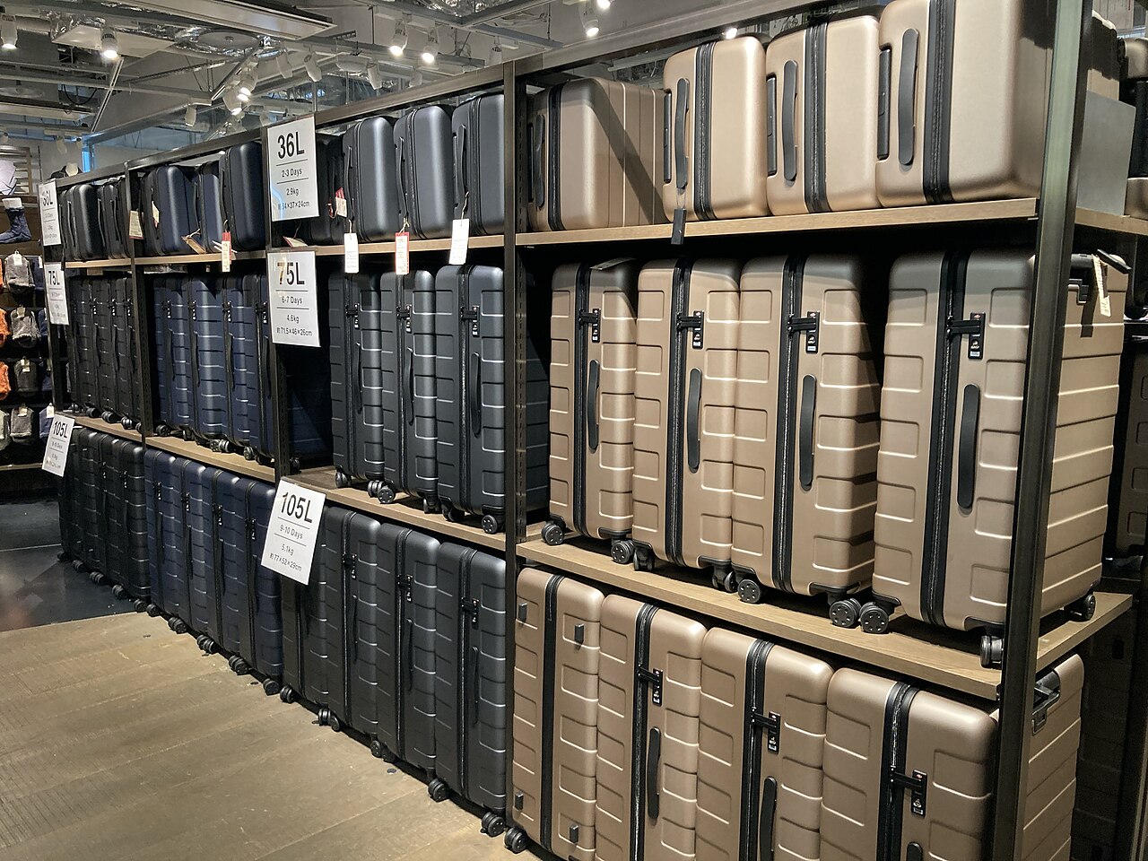 Muji's signature palette — muted grays, browns, and blacks with no visible branding — on display at the Ginza flagship store, Tokyo. Photo: Nick-D, CC BY-SA 4.0, via Wikimedia Commons.
From supermarket house brand to global label
Muji began in December 1980 not as an independent company but as a private-label line inside The Seiyu supermarket chain, launched with just 40 items across food, household goods, and apparel. Japan's economy was in the middle of its rapid postwar boom, and store shelves were filling with heavily packaged, heavily branded 消費 (consumer) goods whose price partly paid for advertising and decoration rather than the product itself. Seiyu's answer was explicitly framed as the opposite: goods that were 質素 and 簡素 (frugal, unadorned), sold under the slogan "wake atte yasui" (わけあって安い, "cheaper for a reason") — the reason being irregular shapes, off-cuts of fabric, broken mushrooms, and other cosmetic flaws that didn't affect quality but had been rejected by branded competitors for not looking perfect.
The line succeeded well beyond a single supermarket chain, and in 1989 it was spun off into its own company, Ryohin Keikaku (良品計画), which has run Muji ever since. What started as a cost-cutting experiment gradually became a design philosophy in its own right, and by the 1990s and 2000s Muji stores had opened across Japan and then internationally, including major flagships in London, Paris, New York, and across East Asia.
"Emptiness," not just simplicity
Muji's aesthetic is often described in English as minimalism, but the company's own design language draws on something closer to Japanese aesthetic ideas of restraint associated with wabi-sabi. Graphic designer Kenya Hara, Muji's art director and board advisor since 2001, has argued that the brand isn't pursuing simplicity (a Western, declarative idea of "less") so much as emptiness (空, from the Japanese aesthetic tradition) — a deliberately unfinished, uncommunicative object that leaves room for the user to project their own meaning and use onto it, rather than one that shouts its function or brand at them. Product designer Naoto Fukasawa, who has led many of Muji's best-known items (the wall-mounted CD player, the humidifier shaped like a rising cloud of steam), applies a related idea called "design dissolving in behavior" — objects so unobtrusive they disappear into daily routines.
This positions Muji as something of a counterpoint to brands like Uniqlo, which also sells simple, affordable basics but leans on visible branding, marketing campaigns, and designer collaborations. Muji instead treats the absence of a visible brand as the brand.
MUJI HOTEL and beyond
The brand's reach eventually extended past retail into hospitality: MUJI HOTEL opened its first location in Shenzhen, China in January 2018, followed by Beijing that March and a flagship in Tokyo's Ginza district in April 2019, each applying the same unbranded, natural-material design language to guest rooms and public space. Muji has also built and sold small prefabricated houses (MUJI HOUSE), run cafés (Café&Meal MUJI), and even operated a co-working and community space, treating the store less as a shop than as a demonstration of an entire way of living.
A broader retail landscape
Muji sits alongside other distinctly Japanese retail formats — the convenience of konbini, the bargain thrill of hyakkin hundred-yen shops, and the fast fashion of Uniqlo — but occupies its own niche as the deliberately anti-consumerist, design-forward option: a bet that in a market saturated with logos, refusing to have one could itself become instantly recognizable.
Related Terms
| Term | Reading | Meaning |
|---|---|---|
| 無印 | むじるし | no brand, unbranded |
| 良品 | りょうひん | good-quality product |
| 良品計画 | りょうひんけいかく | Ryohin Keikaku (the company) |
| わけあって安い | わけあってやすい | "cheaper for a reason" (original Muji slogan) |
Related Dictionary Words
unlabeled; unbranded
fine article; good-quality item; quality product
shopping; purchased goods
consumption; expenditure; spending
brand
simple; plain
life; living
clothes (esp. Western clothes); clothing; dress; costume; suit; outfit
furniture
stationery
storage; putting away
commodity; article of commerce; goods; stock; merchandise
simple; plain
simple; plain; modest